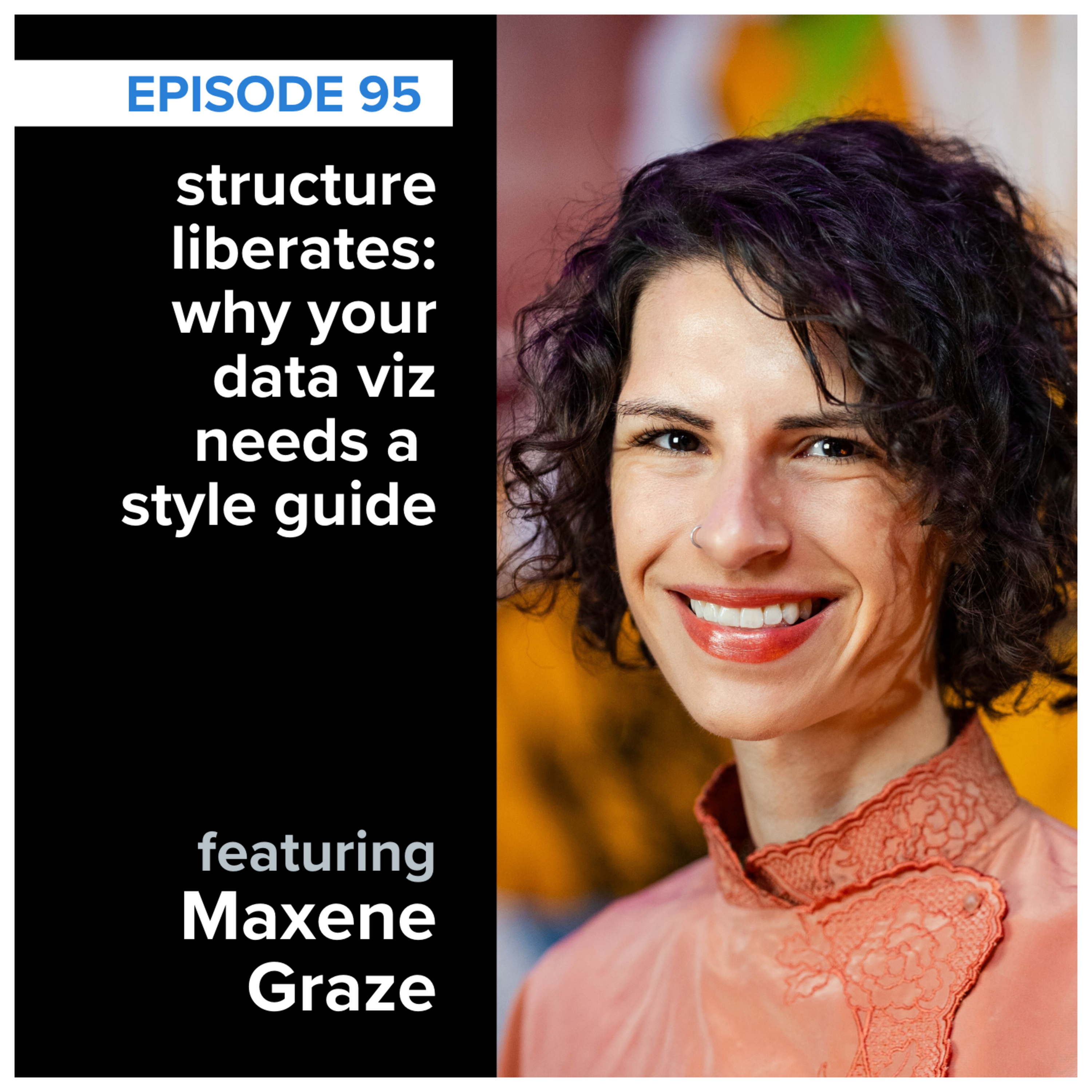
storytelling with data podcast: #95 Structure Liberates – Why Your Data Needs a Style Guide with Maxine Graze
About this episode
In this episode, Simon Rowe chats with Maxine Graze about building data visualization style guides and the importance of structure in data storytelling.
How do you ensure your data visuals are consistently effective—and on brand? In this episode, SWD data storyteller, Simon Rowe chats with Maxine Graze, Senior Data Visualization Engineer at King, about the process of building data visualization style guides. They explore why “structure liberates,” how to balance aesthetics with usability, and why stakeholder feedback is critical. Whether you're designing for dashboards or decks, you'll walk away with ideas on how to bring clarity and consistency to your data storytelling. Related Links: datavizstyleguide.com – Explore open-source data visualization guidelines Better Data Visualizations by Jonathan Schwabish – The book that sparked Maxine’s journey Storytelling with Data Resources – Tools, tips, and templates from the SWD team
People in this episode
Host: Simon Rowe
Guest: Maxine Graze
Topics covered
- data visualization
- style guides
- stakeholder feedback
- clarity
- consistency
Keywords
- data visuals
- style guide
- aesthetics
- usability
- data storytelling
Mentioned in this episode
Organizations: King, storytelling with data, datavizstyleguide.com
Books & works: Better Data Visualizations
More episodes of storytelling with data podcast
- storytelling with data podcast: #97 delivering business value with data, with Shachar Meir
- storytelling with data podcast: #96 what’s the story behind your data? demystifying data equity with Heather Krause
- storytelling with data podcast: #94 the uncharted territory of data and music with Chris Dalla Riva
- storytelling with data podcast: #93 revisiting the magic of story
- storytelling with data podcast: #92 Why Dashboards Die—and How to Save Them With Allison Horst
- storytelling with data podcast: #91 Dashboards that Deliver with Andy Cotgreave
Explore listener stats, chart rankings, contacts and more on the storytelling with data podcast podcast page.