Insights from recent episode analysis
Audience Interest
Podcast Focus
Publishing Consistency
Platform Reach
Insights are generated by CastFox AI using publicly available data, episode content, and proprietary models.
Most discussed topics
Brands & references
Est. Listeners
Insufficient chart data. Estimates will improve as the show charts.
- Per-Episode Audience
Est. listeners per new episode within ~30 days
N/A🎙 ~2x weekly·14 episodes·Last published 7mo ago - Monthly Reach
Unique listeners across all episodes (30 days)
N/A - Active Followers
Loyal subscribers who consistently listen
N/A
Market Insights
Platform Distribution
Reach across major podcast platforms, updated hourly
Total Followers
—
Total Plays
—
Total Reviews
—
* Data sourced directly from platform APIs and aggregated hourly across all major podcast directories.
On the show
Recent episodes
Unlocking the Emotional Power of Data Visualisation and Storytelling
Oct 29, 2025
3m 58s
How Data Visualisation is Transforming Investor Relations
Oct 19, 2025
Unknown duration
How Do You Turn Data into a Story?
Oct 9, 2025
Unknown duration
AI Article Review: VizEval
Dec 3, 2024
Unknown duration
3 Tips to Help You Ask Better Questions for Your Data Viz Projects
Nov 26, 2024
Unknown duration
Social Links & Contact
Official channels & resources
Official Website
Login
RSS Feed
Login
| Date | Episode | Topics | Guests | Brands | Places | Keywords | Sponsor | Length | |
|---|---|---|---|---|---|---|---|---|---|
| 10/29/25 |  Unlocking the Emotional Power of Data Visualisation and Storytelling✨ | data visualisationstorytelling+3 | — | Acast | — | data visualisationstorytelling+3 | — | 3m 58s | |
| 10/19/25 |  How Data Visualisation is Transforming Investor Relations | In this episode, we unpack Felipe Rego’s insights on elevating investor relations through storytelling and data visualisation. Drawing on part of his work with a leading Caribbean financial institution, Felipe discusses how banks and insurers can communicate strategy, performance, and risk with greater clarity, turning investor reports into engaging, transparent, and trust-building narratives. Hosted on Acast. See acast.com/privacy for more information. | — | ||||||
| 10/9/25 | 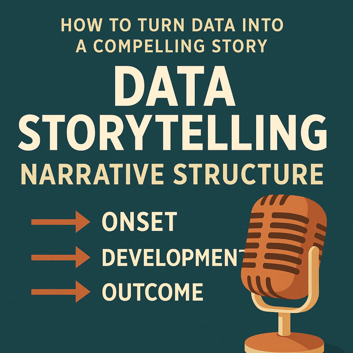 How Do You Turn Data into a Story? | Learn how to turn data into a compelling story using the three-act narrative structure: Onset, Development, and Outcome. This data storytelling framework honed by Felipe Rego helps you set context, uncover insights, and drive decisions with clarity. Move beyond dashboards and reports to create engaging data-driven presentations that persuade, inspire action, and make your data visualization and communication truly memorable. Hosted on Acast. See acast.com/privacy for more information. | — | ||||||
| 12/3/24 |  AI Article Review: VizEval | Revolutionizing Data Visualization: Can AI Turn Words into Good Charts? In this episode we explore the Promise, Pitfalls, and Future of NL2VIS Systems from a recent research from a team at Microsoft Research and ShanghaiTech University. For full article, visit: https://arxiv.org/pdf/2407.00981 Hosted on Acast. See acast.com/privacy for more information. | — | ||||||
| 11/26/24 |  3 Tips to Help You Ask Better Questions for Your Data Viz Projects | In this episode Felipe Rego shares three tips for improving the scoping phase of data, analytics and data visualisation projects: using pauses to gather insights, allowing clients to think aloud, and paraphrasing while asking "why" to better define the problem. Hosted on Acast. See acast.com/privacy for more information. | — | ||||||
| 11/19/24 |  (Loosely) Defining Data Visualisation | In this episode, we briefly and loosely define Felipe Rego's concept of data visualization as a process that involves art and science with the intent to magnify knowledge for those who consume it. Professionals with a good grasp of data visualization are in high demand and developing the necessary skills in this field is a must. Hosted on Acast. See acast.com/privacy for more information. | — | ||||||
| 11/12/24 |  4 Ways You Can Help Your Team Build Great Data Visualisation Projects | This episode highlights Felipe Rego's four key strategies for successful data visualization projects: defining the problem clearly, thoroughly exploring data, developing effective visual encodings, and creating a strong narrative structure to communicate insights. Hosted on Acast. See acast.com/privacy for more information. | — | ||||||
| 11/5/24 | 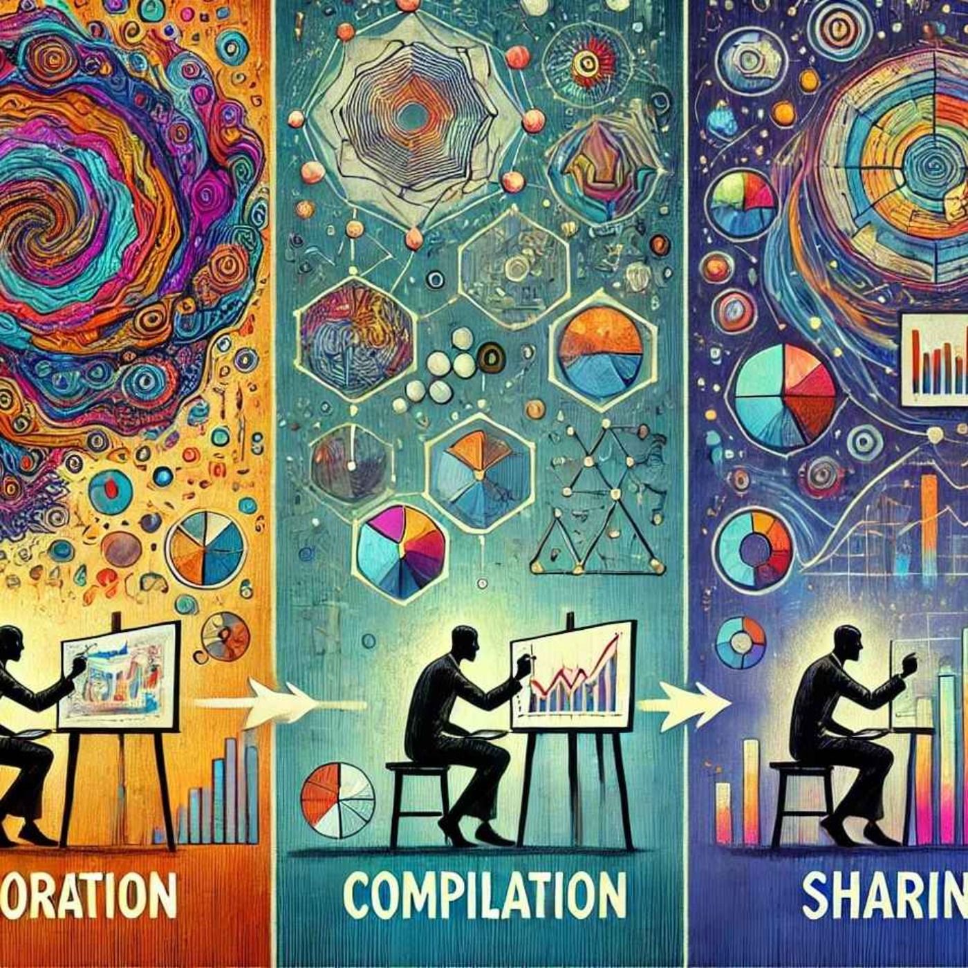 Three Phases of Data Visualization & Storytelling Projects | This episode outlines a three-phase process for successful data visualizations and storytelling solutions: exploration, compilation, and sharing, emphasizing iterative refinement for impactful storytelling. Hosted on Acast. See acast.com/privacy for more information. | — | ||||||
| 10/29/24 |  Elevate Your Data Visualisation and Storytelling Skills | This episode offers practical steps based on Felipe Rego's ideas to enhance data visualization and storytelling skills. It emphasizes having a clear objective, using relevant data, designing with the audience in mind, crafting compelling narratives, and refining through feedback. It also highlights key principles such as simplicity, relevance, and emotional engagement, aiming to transform complex data into impactful and engaging stories that inspire action. Hosted on Acast. See acast.com/privacy for more information. | — | ||||||
| 10/22/24 |  Mastering Data Visualisation and Storytelling: A Guide for Leaders | In this episode, Felipe Rego provides leaders with insights on mastering data visualization and storytelling by focusing on foundational visualization techniques, adopting design best practices, crafting compelling narratives, and leveraging basic tools like PowerPoint and Excel. Leaders are encouraged to bridge the gap between data professionals and decision-makers to drive effective communication and informed decision-making through impactful data stories. Hosted on Acast. See acast.com/privacy for more information. | — | ||||||
Want analysis for the episodes below?Free for Pro Submit a request, we'll have your selected episodes analyzed within an hour. Free, at no cost to you, for Pro users. | |||||||||
| 10/15/24 |  Bad vs Good Data Viz: A Simple Bar Chart Example | Explore the differences between good and bad data visualization through a bar chart example, emphasizing the importance of simplicity, clarity, and logical design choices in telling compelling data stories. Hosted on Acast. See acast.com/privacy for more information. | — | ||||||
| 10/8/24 |  Tips for Creating Better-Looking PowerBI Dashboards | To create better-looking PowerBI dashboards, focus on clarity, simplicity, and interactivity. Start with a plan that clearly defines the dashboard's purpose and audience. Simplify by showcasing only key metrics, using visual hierarchies, and speeding up performance. Customize designs to match branding, and add interactive elements like filters. Lastly, ensure the dashboard tells a clear data-driven story for effective decision-making. Hosted on Acast. See acast.com/privacy for more information. | — | ||||||
| 10/2/24 |  Data Visualization Predictions for 2025 | As we look towards 2025, the landscape of data visualization and storytelling solutions is undergoing a significant transformation, driven mostly by important advances in artificial intelligence (AI). In this article, we explore three key predictions that highlight the emerging trends set to redefine how organizations interact with and visualize data, empower individuals to create data stories, and democratize information. From hybrid AI-human collaboration in data visualization to the integration of AI-powered solutions in decades-old platforms, these shifts are poised to enhance accessibility, improve decision-making, and foster a more data-literate workforce. To stay ahead in this rapidly evolving field, leaders must adapt to these technological advancements and embrace the opportunities they present to their organizations. As you listen through these predictions, consider how your organization can leverage these innovations to drive success and stay competitive in the years to come. Hosted on Acast. See acast.com/privacy for more information. | — | ||||||
| 10/2/24 |  Who is Felipe Rego | Felipe Rego is a leading data science, analytics and data visualisation specialist. He develops analytics and data visualization solutions that help transform organizations. Felipe is also an global educator delivering practical and engaging training programs in data visualisation and storytelling, analytics and other data-related topics. Felipe holds an M.Phil. in Electrical and Information Engineering from the University of Sydney, was a certified Cloud Engineer, and served as an advisor to an Australian government department. For more information about his work, connect with him on LinkedIn or visit his website on: feliperego.com.au Hosted on Acast. See acast.com/privacy for more information. | — | ||||||
Showing 14 of 14
Sponsor Intelligence
Sign in to see which brands sponsor this podcast, their ad offers, and promo codes.